We will introduce the five most commonly used charts: the line chart, the stick graph chart, the candlesticks chart, and the Three Line break chart.
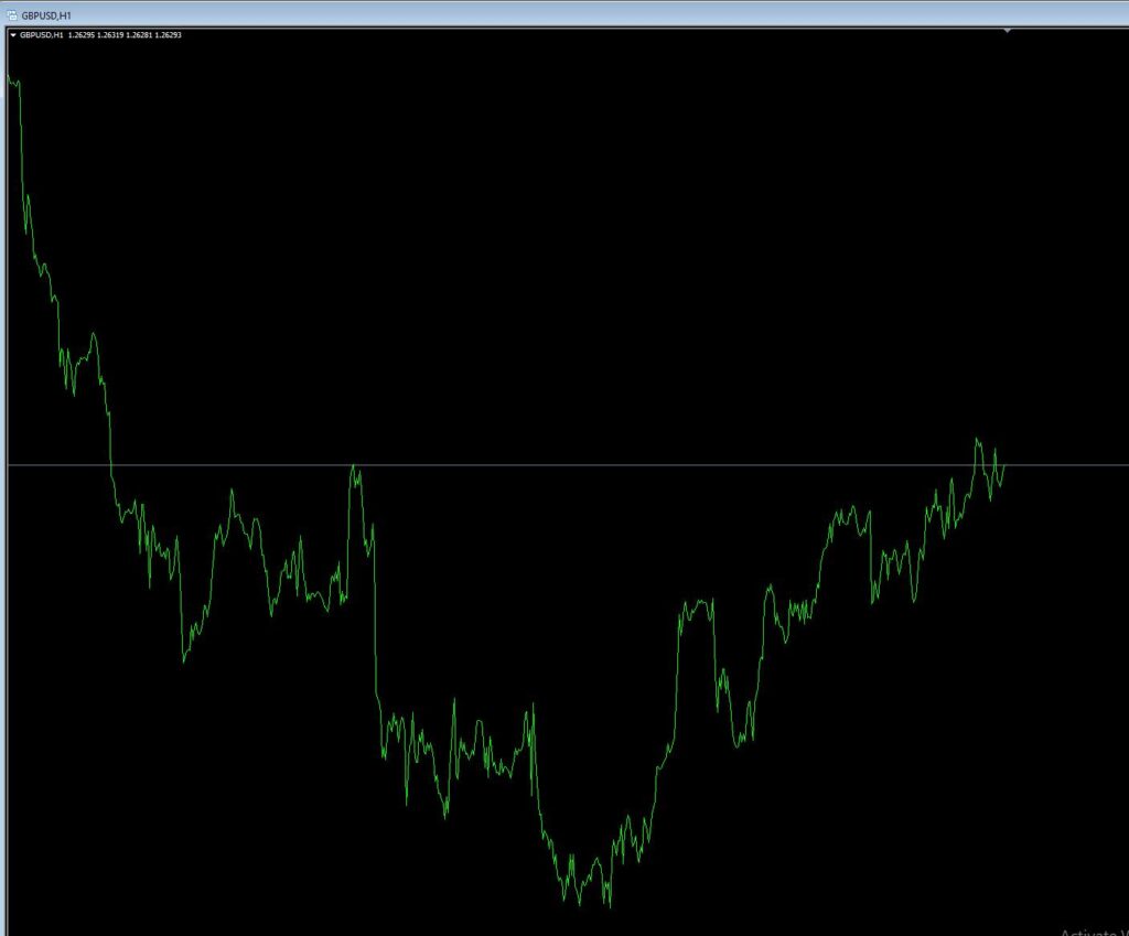
1. Line chart
A line chart is a price chart formed by linking together adjacent closing prices. When all closing prices are linked together, we can see the price movement of the currency pair over a period of time.
2. Stick graph chart
A bar chart showing both the opening price, the closing price and the highest and lowest prices. The top of the bar is the highest price generated during the session and the bottom is the lowest price generated during the session. So the whole bar is the trading range of the currency pair during the session, the small horizontal line on the left of the bar is the opening price for the session and the small horizontal line on the right is the closing price for the session.
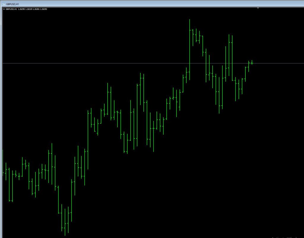
Note: All the ‘price bars’ you see reference to a single piece of price data on the chart, a bar is a trading session, which may represent a day, a week or an hour. When you use a ‘price bar’ you should first find out what time period it represents.
The bar chart is also known as the “OHLC” chart as it shows the four prices, Open, High, Low and Close.
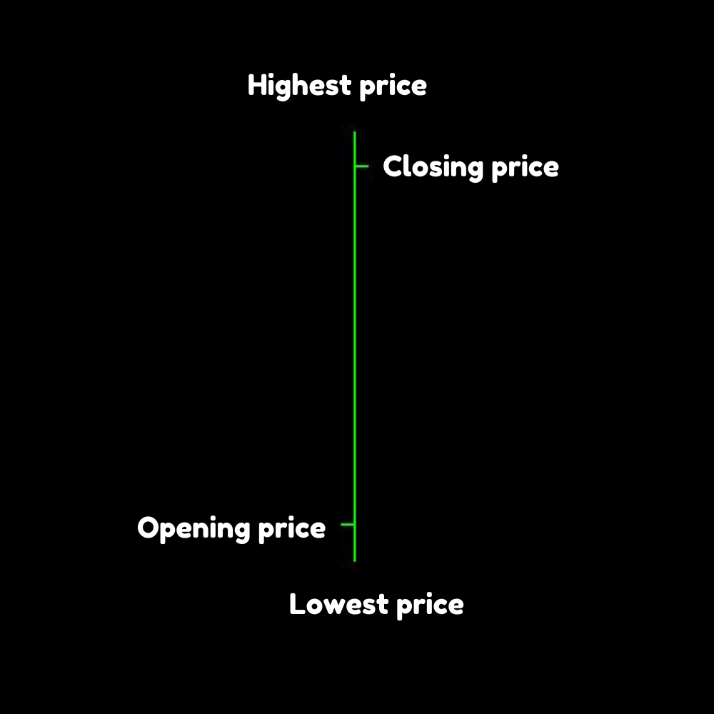
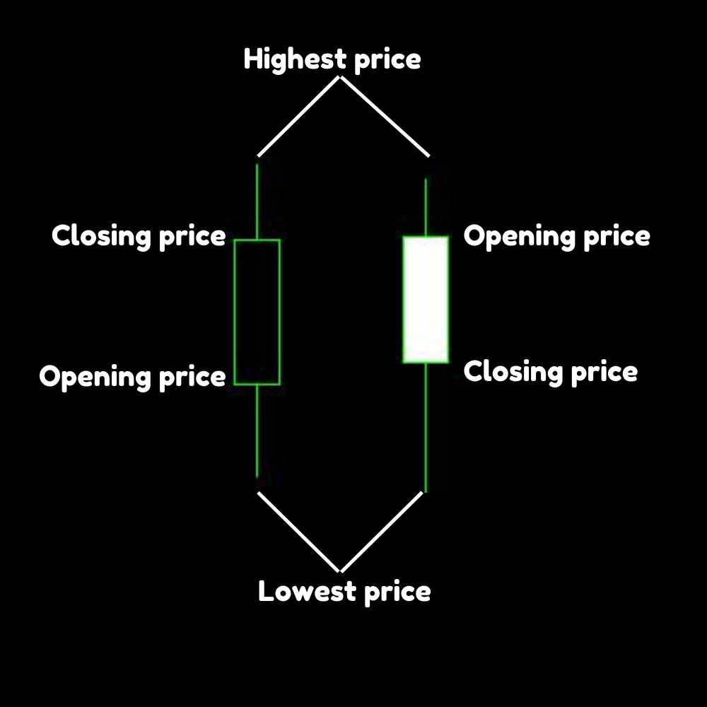
Opening price: the shorter horizontal line on the left is the opening price.
Highest price: The highest point at the top of the vertical line is the highest price for that period.
Lowest price: The lowest point at the bottom of the vertical line is the lowest price for that period.
Closing price: the shorter horizontal line on the right is the closing price.
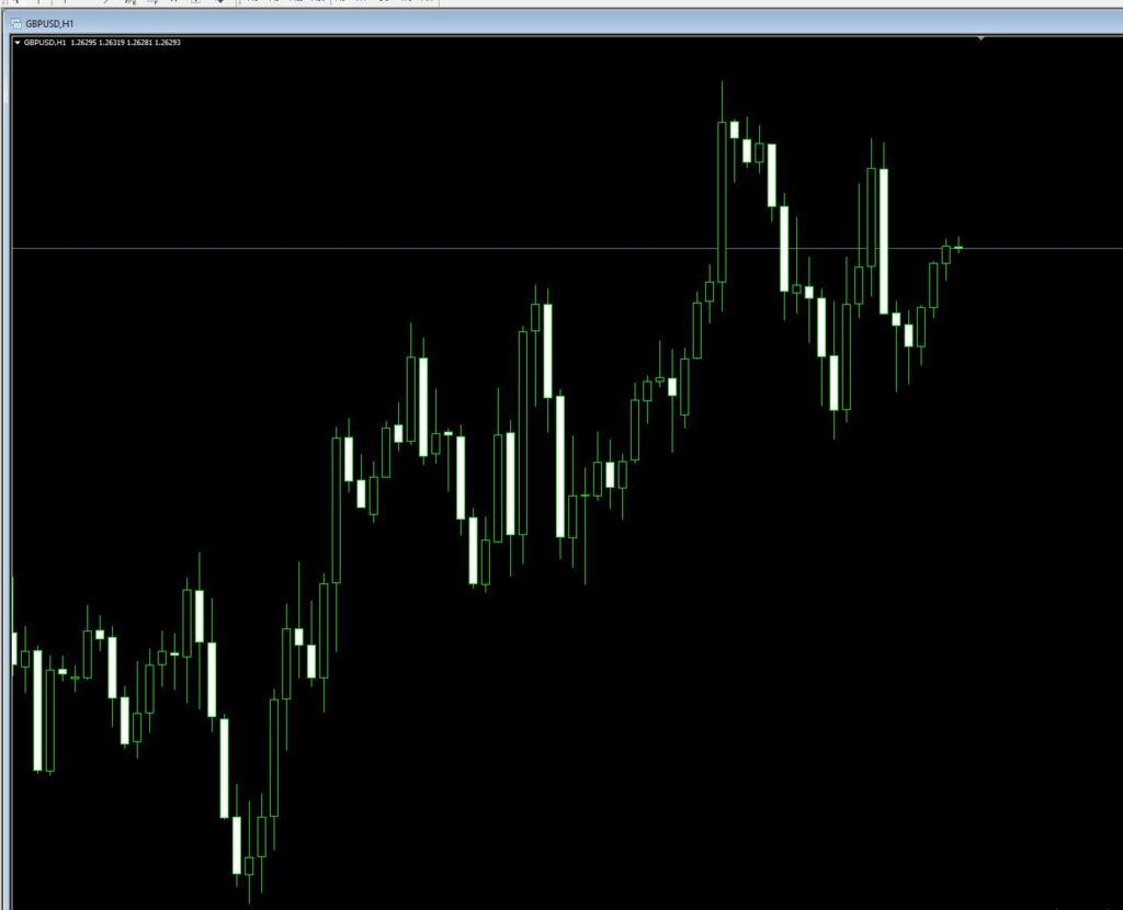
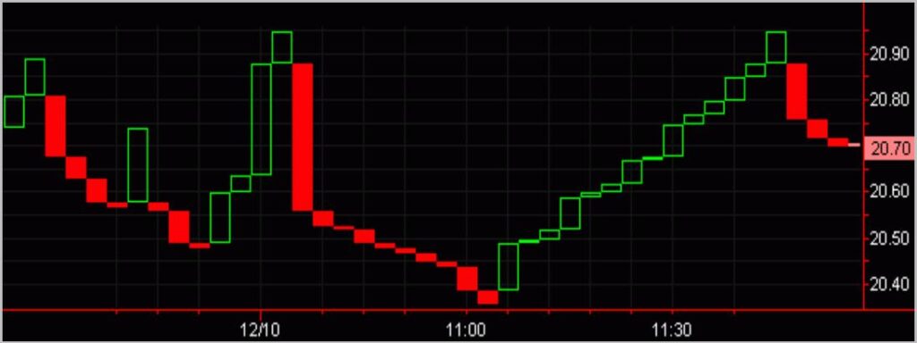
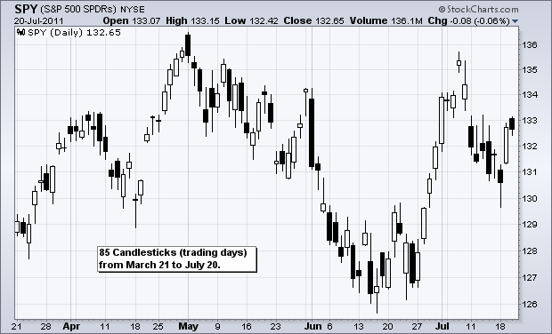
3. Candlesticks chart
The stick graph chart shows the high and low points of the period by a vertical line, in a candlestick chart, the wider part of the vertical line is the price range between the opening and closing prices. If the closing price is lower than the opening price, the wider part is coloured in and called a negative candle, as opposed to a negative candle, the positive candle is a candle line with a closing price higher than the opening price.
The colour of the fill is black, the top end of the coloured solid is the opening price and the bottom end is the closing price. If the closing price is higher than the opening price, then the solid part will be white, i.e. a hollow body without colour fill.
The purpose of a candlestick chart is to provide a visual aid, as the same information is represented on the OHLC chart.
The main advantages of candlestick charts are as follows:
(1) Candlestick charts are very easy to interpret, intuitive and visual, and the best tool for beginners to start learning chart analysis.
(2) Candlestick charts are very easy to use and their basic images are easy to remember and understand. Your eye will quickly adapt to the information of the symbols on the candlestick.
(3) Candlesticks and candlesticks have very interesting patterns and names, such as shooting stars. These naming will help you to remember these patterns very quickly.
(4) Candlestick charts are very good at identifying turning points in the market, whether such turns are from the bottom up or from the top down.
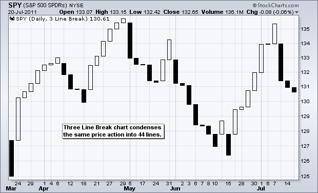
4. Three Line break charts
The Three Line break charts are a series of vertical lines that reflect price movements, and ignore the time element of price movements. Steven Nison describes the Three Line break charts in detail in his book ‘The Non-K-Line Approach to the Market’.
A black bar of buy signal is given if three K lines continue to rise to a new short-term high.
or a red bar of sell signal is given if three K lines continue to fall to a new short-term low, as shown below.
Unlike the usual indicators, this indicator does not easily signal during the usual consolidation, and it is a class of indicators that proposes to chase up and down when there is a clear unilateral trend. It effectively removes the distraction of irrelevant consolidation in the market and oscillatory retracements in rising bands, making it more suitable for investors of the more trend-heavy kind in medium to long-term investments that make larger swings and larger trends.
Plotting of the Three Line break charts, usually based on the closing price.
Three Line break charts are usually done as follows and show in the following figure:
(1) If the price exceeds the highest price of the previous line, a new white line is drawn.
(2) A new black line is drawn if the price is below the lowest price of the previous line.
(3) If the price is within the range of the highest and lowest price of the previous line, no chart line is required.
Steven Nison recommends combining the Three Line break charts with the K-line chart to judge the market, using the Three Line break charts to determine the prevailing trend, while trading with reference to line patterns with time coordinates.
If the trend formed is strong and powerful, then a continuous line of three values of the same colour is formed on the chart, and a new transitional line can only be created if the price breaks the extreme price of the three most recent new triple lines.
Specifically: if the price rise is strong and powerful, a continuous white up trine will be formed on the chart, and a new black down trine can only be drawn if the price breaks below the lowest of the three nearest white up trine; if the downtrend continues to be strong, a continuous black down trine will be formed on the chart, and a new black down trine can only be drawn if the price breaks above the highest of the three nearest black lines. a new white rising trine is drawn.
The following are the basic trading principles for the new trine chart.
(1) Go long when the new triple value-line turns from a black line to a white line (a white turn value line).
(2) Short the new triple value-line when it turns from white to black (a black transvalued line).
(3) Do not trade in sideways markets where there is no trend, as the new triple value line will repeatedly turn in value.
The advantage of the Three Line break charts, it removes the element of subjective and arbitrary emotion when judging a turnaround, and signals a reversal by discovering the true state of the price.
The disadvantage of the Three Line break charts is that by the time a turnaround is generated, the new trend has already been in place for some time. However, many traders are happy to accept a delayed signal in order to follow the main trend.
Traders can adjust the sensitivity of the turn criteria by varying the number of lines. For example, a short term trader may use a two-line reversal to get more reversal signals, while a long term trader may use a four or even ten-line reversal to filter the number of reversal signals.
Contact us for MT4 indicator codes of Three Line break charts.

